Capturing “captain” journeys from dock to database
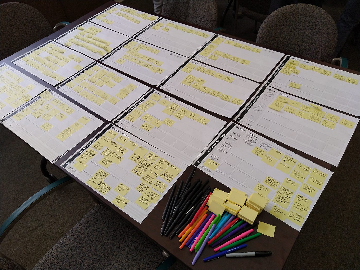
A table holding 15 pieces of paper labeled ‘captain’s journey’ with many small yellow sticky notes on each. The stickies have tiny handwritten notes on them and there’s a pile of colored pends and blank sticky note pads in the lower right corner.
Digital data collection is becoming the norm in every field, including commercial fishing. While there are high tech vessels with constant satellite connections, that’s a fraction of the 2.8m global fleet, including the 75,000 or so commercial fishing boats in the United States[1]. That means fishing software and hardware needs to work with limited connectivity as well as glare, saltwater, and — ideally — big rubber gloves. Many of these products need to feed into regulatory systems, so you’ll have to account for that on the backend, and while you may be in a position to mandate use of your app regardless of usability ignoring UX/UI altogether generally leads to lackluster adoption or worse unintended consequences. All this in a space where public budgets are tight and private profit margins are thin.
These aren’t new challenges for anyone working in civic tech (except maybe the saltwater corrosion) and we’re immensely grateful for the documentation that other designers and product managers have shared about their experiences. We’re offering these reflections in the interest of adding to that body of knowledge and expanding the chapter on fisheries. We had the chance to support a team at NOAA Fisheries’ Northwest Fisheries Science Center and support them in applying modern product development practices to a new multi-function platform for fishermen[2]. Here are our takeaways:
The benefits of partnership
We came into the project through a public-private partnership, where the core work was done by an internal team with government funding, while our team had philanthropic funding from the Net Gains Alliance to augment their work and fill gaps. We had strong and dedicated agency partners but it was a small team with a long backlog. We offered general PM support and took on tasks that were easier for an external partner to do. For example, as a number of groups have pointed out, the Paperwork Reduction Act limits federal agencies’ ability to do surveys, especially on topics that are considered to change rapidly like mobile device ownership. We looked at publicly available survey data, but, as we quickly learned, general smartphone trends were not indicative of what devices were in the hands of our target fishermen. Our team had the capacity and flexibility to do design interviews, especially before we had anything to test, and we could add a layer of privacy protection in how we synthesized and stripped personal details out of our reports. Also, we could pay for snacks and coffee, which are essential to good conversations and often excluded from government budgets.
Keep the internal users engaged
The lead developers set up bi-weekly check ins with the internal agency teams, including managers and the staff working on compliance and enforcement. If you’re in the private sector reading this we can hear you rolling your eyes at something that might seem blindingly obvious but treating your agency colleagues as customers who should be engaged with and delighted by your products is still a bit of a culture shift in civic tech, especially in agencies that have not been first in the digital transformation queue, like many natural resource agencies. Agency staff are used to frequent, long meetings; they are less familiar with two-week sprints that result in new wireframes based on the feedback they provided last time. We wrote up some guides for the NOAA Fisheries team (drawing heavily on work from 18F and USDS) that mainly served to reinforce the best practices they were already deploying, tie them to other civic tech efforts, and make them fishier. Getting the internal users accustomed to regular check-ins made discussions easier once we had to start making tradeoffs between fishermen’s and managers’ requirements.
We made wall posters illustrating Lean Design for fish
Recruiting fishermen testers took more time than we anticipated
We were doing this in 2020, when COVID-19 meant everything took longer than expected, but still it was quickly clear that we had an uphill job working in a community that was unfamiliar with user testing. Kate’s worked in and around West Coast fisheries for over a decade and contacted fishermen she knew, including ones who’d participated in design sessions on other projects. We had agency staff with longstanding industry relationships help with outreach. We offered to run tests on the weekends, early in the morning and late at night. We tried to set up an in-person testing event, but COVID-19 restrictions shut that down. Overall it took more than a month to build our first testing group and we didn’t get the full range of perspectives we wanted (operating systems, vessel configurations, ports). We asked the people who did participate to recruit their friends and family. Once people had participated, we asked them if they’d be willing to do a second session later we could show how we’d incorporated their feedback, which most agreed to.
We paid them
We asked for an hour of their time and tried to wrap up our discussion on time, although some wanted to talk longer. For that, we offered them $100 in compensation, which some declined. We advertised that we were paying testers in our recruitment emails but this did not seem to affect our recruitment. We made the decision to compensate people before COVID-19 cases started spiking in the U.S. and we were glad we did once ports and seafood supply chains started shutting down and fishermen were tied up at the dock. Even without a pandemic, we support compensating participants when you can as a matter of fairness and because it’s common practice in the private sector, sending a signal that fisheries and natural resource tech is as worthy of good design.
It was worth it
Even with all our constraints we got so many of the great outcomes you want out of design testing: original ‘brilliant’ ideas were scrapped and iterated, testers were delighted by things no one thought of as ‘features,’ small changes brought big delights, and bugs were squashed. Maybe most importantly, the testing sessions offered a dialogue opportunity between agency staff and fishermen based on listening and learning, not regulating. The development team had asked to be on the virtual testing sessions to hear feedback firsthand. We gave testers the option to talk just with us or have agency staff on as well and all opted to let staff participate. This led to some real-time ‘a-ha’ moments about the product design, and about the way the platform would operate inside a larger political and management context, one where the developers had limited control. There were things the apps couldn’t change, but for what they could do, and what they needed to do, they’re doing a better job of it because of testing and the input of fishermen.
[1] FAO 2018 Statistics and that’s an estimate.
[2] We’re saying “fishermen” because that’s the term people asked us to use. There’s a whole paper on “Should we call them fishers or fishermen?” if you want to dive into the terms, and we tried out a few other words like “captain” as we went along but here we’re going with what they asked to be called.

